Case Study
Nizio
UX/UI Design
.svg)


.webp)
.webp)
.webp)
No items found.
For Nizio, a family-run company from Biłgoraj, Poland, that makes solid wood beds and furniture, we designed a new online store: from analysing customer behaviour, through UX wireframes, to a complete UI design for desktop and mobile.

Nizio is a family-run company from Biłgoraj, Poland, that has been making solid wood furniture since 1959. Its flagship products are beds: bunk beds, loft beds, singles and doubles, sold in Poland and in several markets abroad. The client came to us with a working store and a clear brief: the new design should make it easier to choose and configure a piece of furniture, bring order to the range and do a better job of showing the quality behind the brand.
The store is there to sell, but Nizio furniture is not an impulse buy. People take their time choosing a bed: they compare versions, check dimensions and look at lead times. So the design set out to:
The main audience is parents and parents-to-be, mostly women, who are furnishing a child's room and want furniture that will last for years. They are willing to pay more for solid wood and Polish craftsmanship, but they expect certainty: clear information about dimensions, safety, delivery and returns. The second group is architects and interior designers, for whom we designed a dedicated page about working with Nizio.
Our scope covered analysis, UX wireframes and the UI design of the desktop and mobile versions. The store runs on Shopify, and the build was handled by an external team on the client's side.
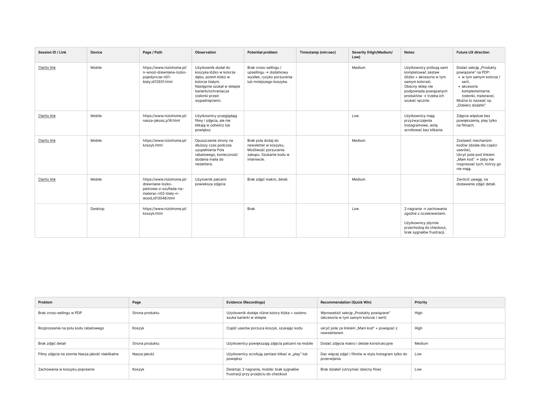
We started with data from the existing store. In Microsoft Clarity we went through heatmaps and session recordings, then sorted the findings using the MoSCoW method, from must-have changes to those that could wait. Alongside that we wrote down design principles based on Nielsen's heuristics and came back to them at every later stage.
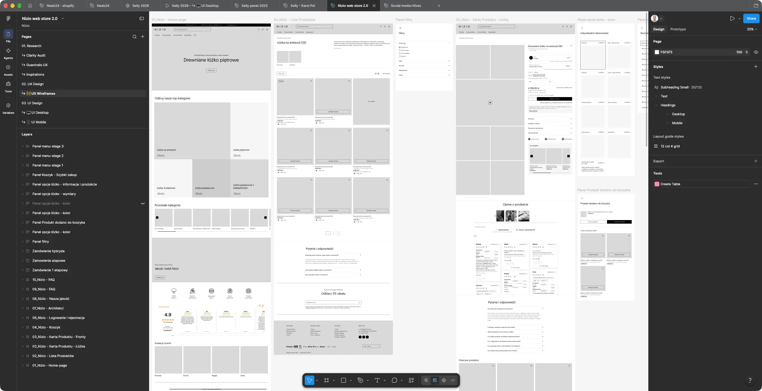
The wireframes set the structure of the key views: the homepage, product listing, product page, cart and checkout. We drew up the purchase flow in three variants so that, together with the client, we could pick the one that asks the fewest steps of the buyer.
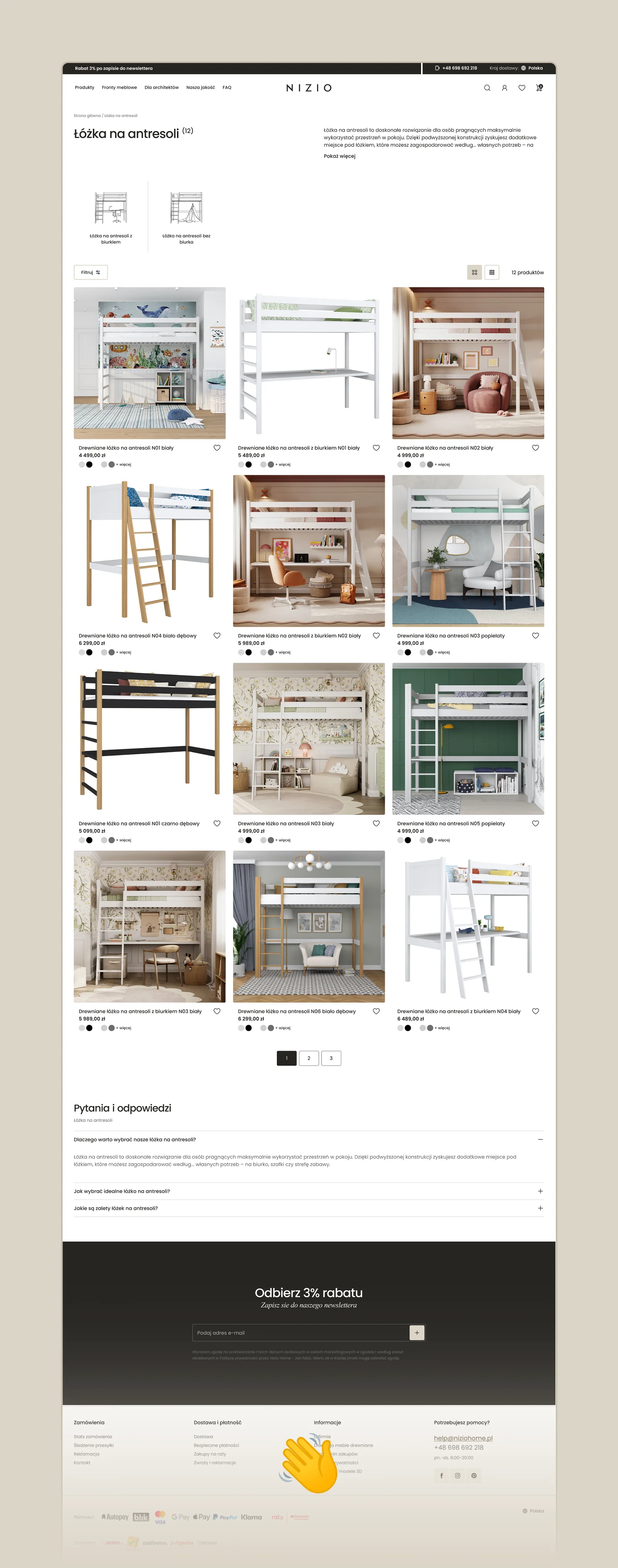
A category, loft beds for example, splits into clear subcategories shown right above the list. Shoppers can switch the grid between three and four columns, and filters open in a side panel without covering the results. Hovering over a product reveals the next photo from its gallery.

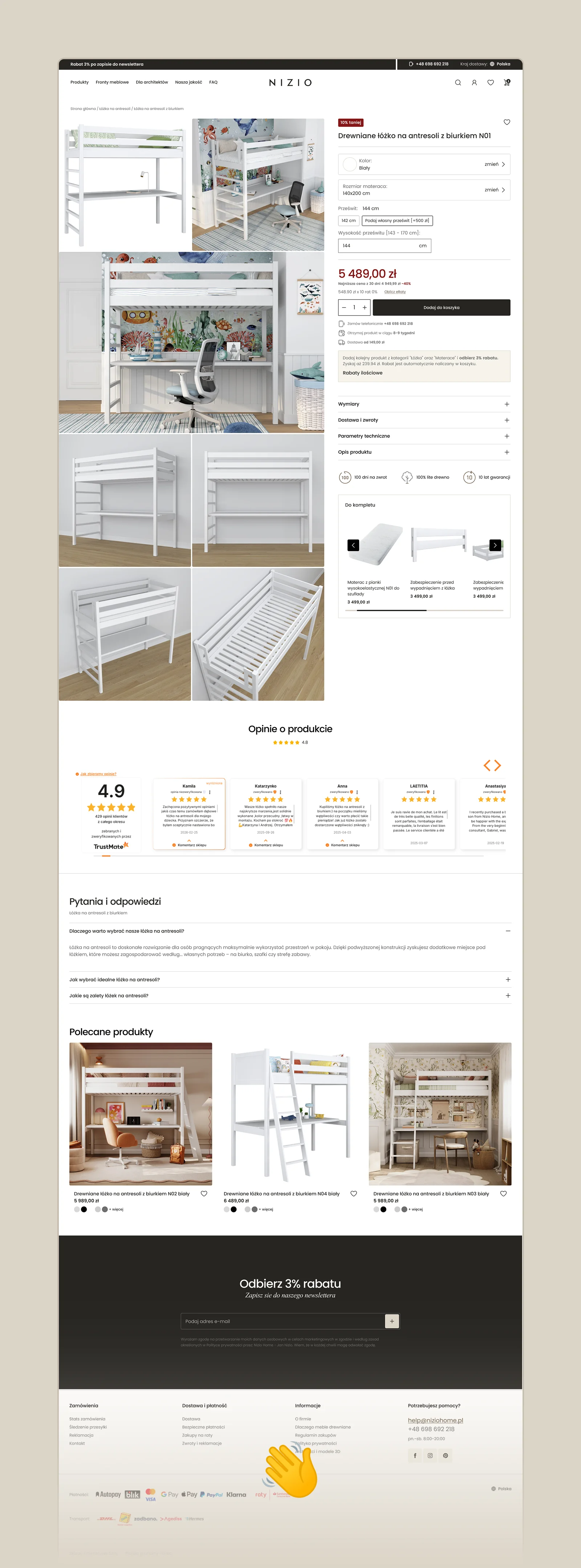
This is the most important screen in the store. Next to a large gallery with photos and a video we placed the configuration: colour, mattress size and clearance height, which the buyer can enter as a custom value. Right below the price they see the lead time, delivery cost, instalment option and the discount for adding another product. The “Complete the set” section suggests a mattress and safety rails that fit the chosen bed.
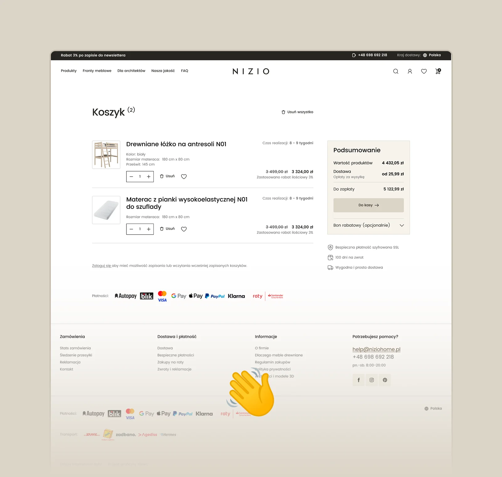
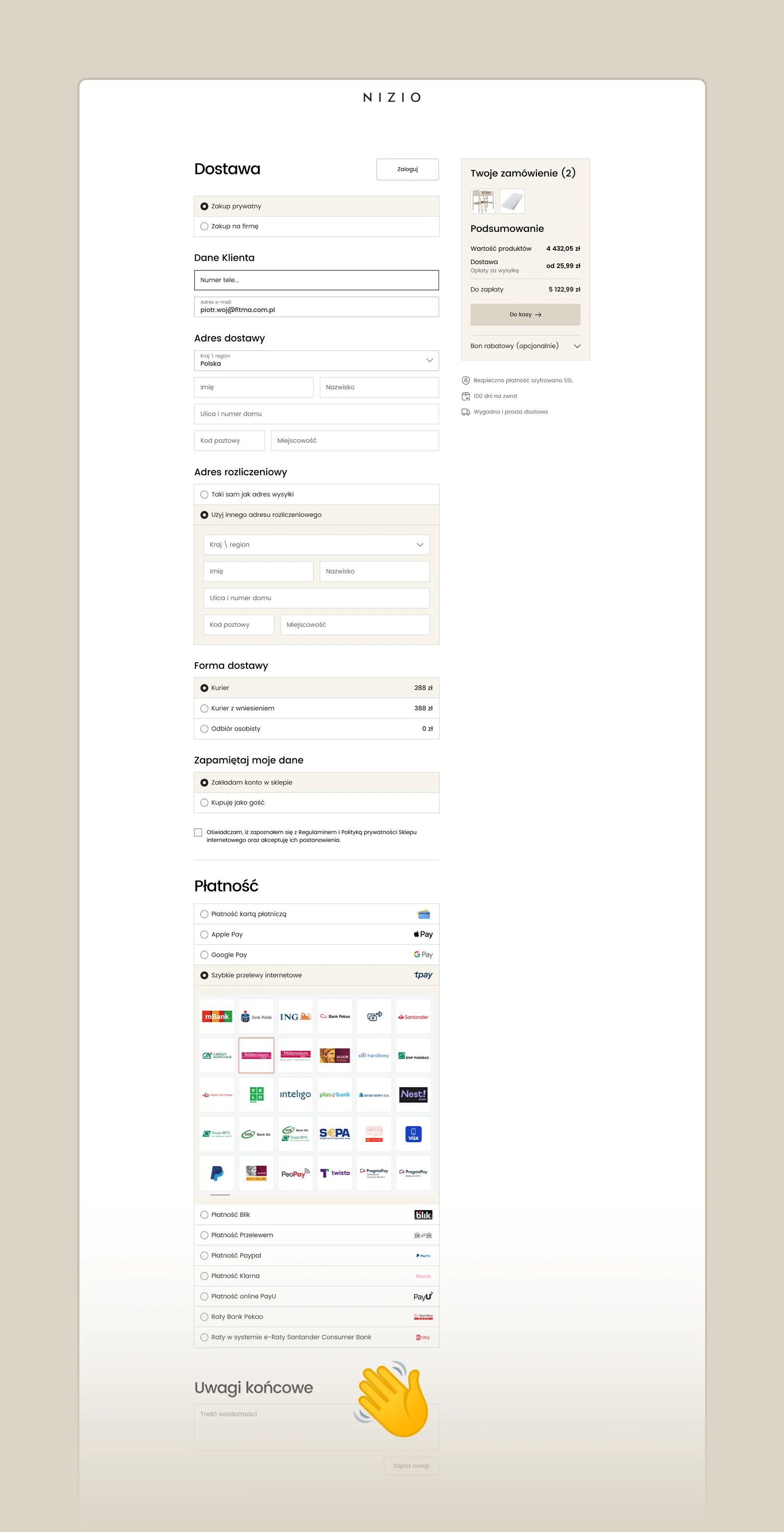
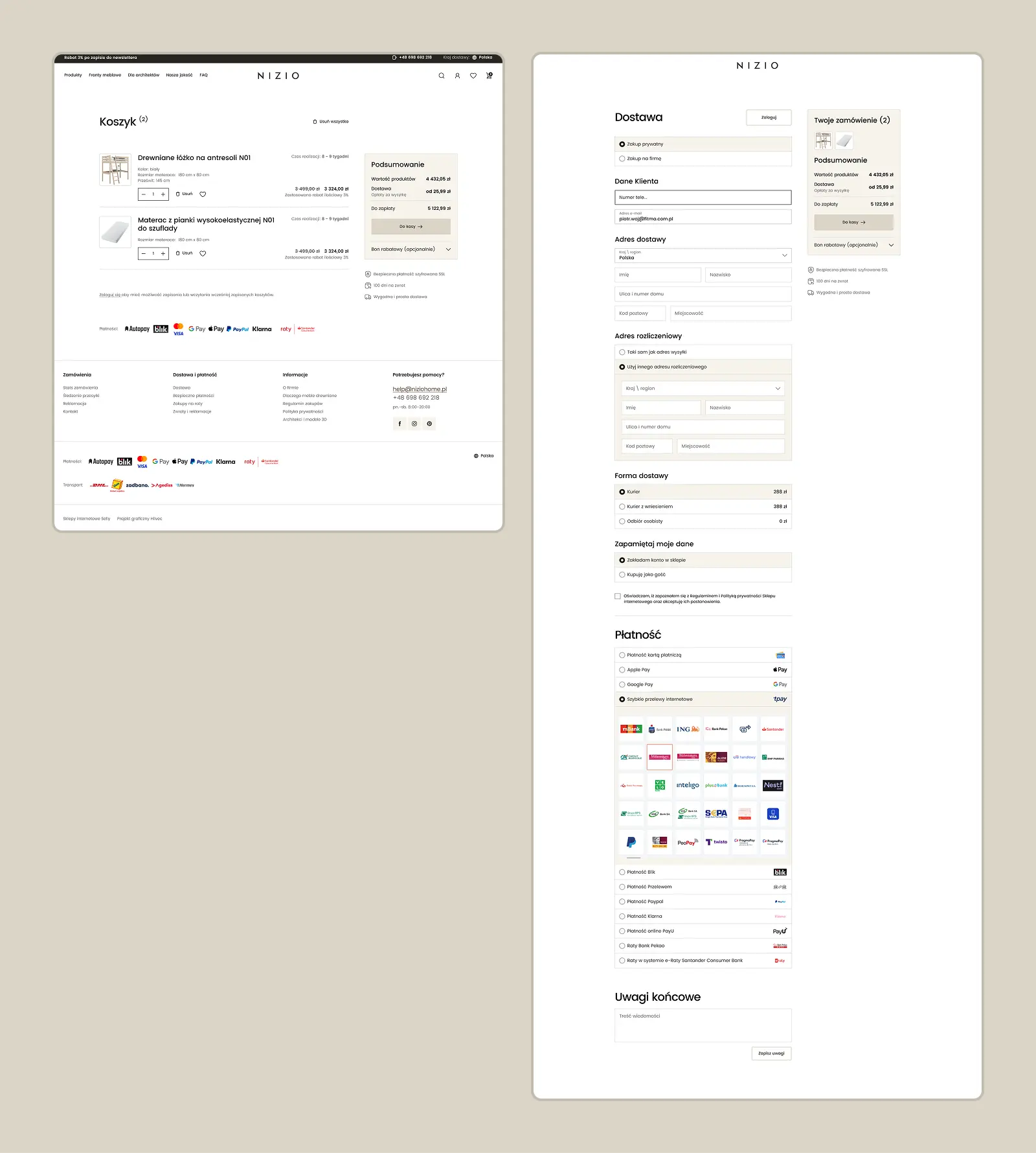
Once a product is added, a panel slides out with a summary and a suggestion to complete the order. The checkout itself fits on a single screen: details, delivery and payment are visible at once, with no moving between steps.
We designed every view separately for phones. Everything is built on a component library and a style guide (colours, typography, buttons, product tiles), so the implementation team received a consistent set of elements for building further pages.
We handed the design over in Figma to the team that built the store on Shopify. On this page we show the design as we delivered it.
The client received a complete store design: the homepage, product listing and product page, cart, checkout, login, the “For architects”, “Our quality” and FAQ pages, and views for international customers, all in desktop and mobile versions. The Nizio store is live at niziohome.pl.
.svg)